Food webs as network graphs-- Part 3: The Code
This is Part 3 in my three-part series on visualizing food webs as network graphs.
Part 1 – Part 2 – Part 3
Update 08/24/2016: This post was written early in the development process of this tool. Updates continue alonside manuscript preparation; the most recent code (not yet documented) can be found here.
The toolbox
The food web diagrams seen on my Ocean Sciences 2016 poster were created using code written in Matlab and javascript. The code collection can be downloaded from GitHub. In order to run this code, you must be running Matlab R2015b or later.
I did originally have the goal of providing a pure javascript-plus-html version of this toolbox, making it platform independent and eliminating the need for Matlab (which I love, but is expensive).
Unfortunately, the edge-bundling calculations have proven too computationally-intensive for this, at least with my rather rudimentary javascript programming skills (I’ve played around with some other implementations of force-directed edge bundling in D3, such as this one, and they too slowed to a painful crawl when I tested them on even small food webs). And the resulting SVGs, with thousands of components (or hundreds of thousands, when attempting to add edge color gradients), were terrible to try to work with (crashed a couple browsers and Adobe Illustrator, though Inkscape was generally up to the task).
So, in the end, the majority of the code I developed for this process is written in Matlab, simply because that’s where I do most of my work. Apologies to all the R and python people out there.
The following example will take you through the full process of using this code to create a food web diagram based on an Ecopath food web model. For for information about each Matlab function, you can check the function help in the header of each file (type help <functionname> from the Matlab Command Window).
The process
Step 1: Start with an Ecopath model
Although this graphing process can be applied to any network food web, many of the calculations (network fluxes, trophic levels, etc.) in this particular code suite are based on my Matlab implementation of the Ecopath model. Ecopath with Ecosim is a software suite, used primarily in fisheries modeling, which calculates a mass-balance snapshot of the biomass pools and fluxes in a food web.
You can import an Ecopath model into Matlab using one of two processes:
mdb2ewein.m: This function reads information directly from an EwE 6 database file (.EwEmdb file). This function relies on the mdbtools utility to extract info the the Microsoft Access file format, so that needs to be installed prior to running this.rpath2ewein.m: This function reads food web data from a set of Rpath .csv files. Rpath is the R implementation of Ecopath with Ecosim. It is currently still in beta testing, so this format is loosely documented for now; it will be updated once Rpath is officially released.
Alternatively, you can manually contruct the necessary input structure by following the description of the input in ecopathlite.m.
For our example, we’re using the direct import method, with one of the ecosystem models that ships with Ecopath with Ecosim.
1
Ewein = mdb2ewein('Generic_37.EwEmdb');
(Note: It turns out this was a somewhat poor choice of an example ecosystem. The functional groups in this food web are already pretty cosolidated, so much so that the trophic grouping algorithm can settle into a few different local minima when run repeatedly. So you may get slightly different results than I did when you run this code.)
Step 2: Convert to a graph object
The conversion is performed via the ecopath2graph.m function:
1
G = ecopath2graph(Ewein);
Step 3: Prepare graph object for trophic grouping
As discussed in the previous blog post, this involves removing out-of-system nodes and non-predatory flux edges.
1
2
3
4
5
6
7
8
G2 = G;
detid = G2.Nodes.Name(G2.Nodes.type == 2);
oosid = G2.Nodes.Name(G2.Nodes.type == 4);
G2 = rmnode(G2, oosid);
isdet = ismember(G2.Edges.EndNodes(:,2), detid);
G2 = rmedge(G2, find(isdet));
You may find you want to make some other manual changes for visualization purposes. For example, I often limit the biomass of detrital groups, which can be much larger than the living groups, to avoid unnecessarily giant nodes in the final visualization.
Step 4: Calculate trophic groups
Trophic groups can be calculated with the gauzensgroupep.m function:
1
grp = gauzensgroupep(G2, 1, 'type', 'trophicgroup');
Step 5: Position nodes
As discussed in the previous post, the main positioning calculations are carried out by a javascript function. A few functions allow us to call this javascript function from within Matlab.
First, we need to set up input data that meets the formatting requirements of the javascript function (which uses the JSON format to list nodes and their hierarchical relationship to each other). The second output of the trophicgroupgraph.m function matches this format:
1
[H3, G3] = trophicgroupgraph(G2, grp);
We can then pass this new graph object to the renderfoodwebforce.m function. The renderfoodwebforce.m function is a wrapper that creates an empty webpage and then runs the foodweblayout.js script with your chosen parameters. There are a lot of user-controllable parameters; you can use the 'test' mode to see how changing those affect your food web. Particularly for large food webs, small changes in things like padding (space around nodes), charge (repelling force between nodes), trophic nudging (speed at which nodes move toward their trophic level), scaling factor for initial node size (smaller space leads to smaller nodes with more room to move, while larger, closely-packed ones can get tangled up), and even the random seed (there’s a bit of randomness in the collison-avoidance code) can change the way the final layout looks.
Once you’ve settled on a good set of parameters, you’ll need to pull the coordinate information out of the html file and into Matlab. At the moment, this step requires the use of phantomJS. I’m looking for a solution that doesn’t require you to install that, but for now, it’s necessary.
1
2
3
4
5
6
7
8
9
10
11
12
13
14
15
16
opt = {'drawmode', 'force', ...
'init', 'cpack', ...
'cpfac', 0.6, ...
'totheight', 600, ...
'totwidth', 500, ...
'fontsz', 8, ...
'charge', -100, ...
'padding', 10, ...
'tlnudge', 2.0, ...
'tllim', [0.5 5]};
% Uncomment to test different parameters
% [hw, stat] = renderfoodwebforce(G3, 'mode', 'test', opt{:});
[C,T,F] = renderfoodwebforce(G3, 'mode', 'extract', opt{:});
In 'extract' mode, this function returns data about all the circle and text objects in the resulting webpage. To get that data into slightly more user-friendly format, run foodweblayoutdetails. This adds a few new fields to the Nodes table of the graph object: x/y-cooridnates of the node center, radius of the node, x/y-coordinates of the text label, and horizontal and vertical alignment of the text label.
1
[G2, Ax] = foodweblayoutdetails(G2, C, T, [0.5 5]);
Step 6: Run edge bundling
We’ll run the algorithm using the logarithmic weighting function, as discussed in Part 1 of this series:
1
2
3
wlim = minmax(log10(G2.Edges.Weight), 'expand', 0.01);
wtfun = @(x) log10(x) - wlim(1);
G2 = debundle(G2, 'edgefun', wtfun, 'l', 100);
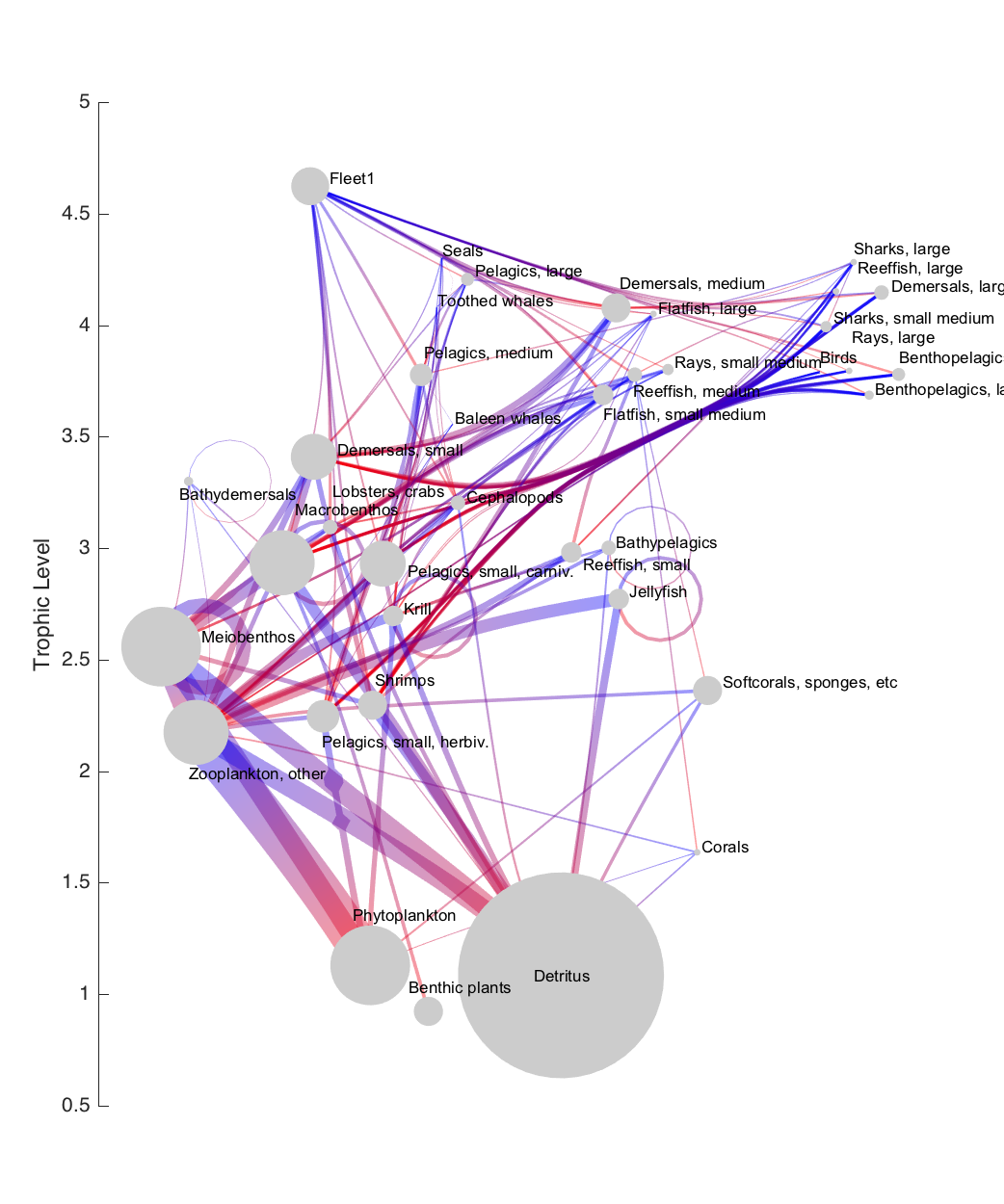
Step 7: Plot
At this point, we have all the information we need to plot the final figure in Matlab.
One thing to note, before creating our figure, is the conversion of units that took place under the hood of step 5 (in foodweblayoutdetails.m). To make it easier to add a trophic level axis to the final plot, I chose to convert all positioning information from pixel space to trophic level units. However, in order to keep all the text positioning identical to the javascript-produced figure, we need to create a new axis with the same size (in pixels) as the SVG grouping object in the webpage. That info is stored in the Ax output structure. So first, we set up an appropriately-sized axis, with the color of the x axis turned off (the x-axis coordinates are arbitrary, so an axis there serves no purpose):
1
2
3
4
5
6
7
8
mar = 50;
h.fig = figure('position', [10 10 Ax.dx+mar*2 Ax.dy+mar*2], 'color', 'w');
h.ax = axes('units', 'pixels', ...
'position', [mar mar Ax.dx Ax.dy], ...
'xlim', Ax.xlim, ...
'ylim', Ax.ylim, ...
'xcolor', 'none');
hold on;
Plot the edges using the plotdeb.m function:
1
2
h.edg = plotdeb(G2, 'p', 1/3, 'w', 50, 'rloop', 50);
set(h.edg, 'clipping', 'off');
Nodes can be plotted as circular patches, using the coordinate and radius details added to the graph object in the previous step:
1
2
3
4
5
6
th = linspace(0,2*pi,50);
h.nd = arrayfun(@(x,y,r) patch(r.*cos(th)+x, r.*sin(th)+y, 'w'), ...
G2.Nodes.x, G2.Nodes.y, G2.Nodes.r, 'uni', 0);
h.nd = cat(1, h.nd{:});
set(h.nd, 'facecolor', ones(1,3)*0.8, 'clipping', 'off', ...
'edgecolor' ,'none');
Text placement is also based on the details in the graph object:
1
2
h.txt = text(G2.Nodes.tx, G2.Nodes.ty, G2.Nodes.Name, 'fontsize', 8, 'fontname', 'Arial');
set(h.txt, {'horizontalalignment', 'VerticalAlignment'}, [G2.Nodes.th G2.Nodes.tv]);
Finally, add a label to the trophic level axis, and change the colormap to a red-to-blue one. The colormap choice is a personal preference; red-to-blue is nearly isoluminant, so it makes a good choice here (a more isoluminant red-to-green colormap is often used in figures like these, but I try to avoid that due to colorblindness issues).
1
2
ylabel('Trophic Level');
colormap(usercolormap([1 0 0], [0 0 1]));
The end result: