Food webs as network graphs-- Part 1: Edge Bundling
This is Part 1 in my three-part series on visualizing food webs as network graphs.
Part 1 – Part 2 – Part 3
This series of blog posts is a supplement to my Ocean Sciences 2016 poster presentation: “Visualizing Ecosystem Energy Flow in Complex Food Web Networks: A Comparison of Three Alaskan Large Marine Ecosystems,” available for download here. This blog post will explain the theory behind the food web visualizations, and offer a step-by-step procedure (with code) to create similar food web diagrams from your own food web network data (specifically, Ecopath model data).
Introduction
Food webs are a central focus of my research, and for papers and presentations, I usually like to include a visualization of the food web being discussed. In simple models with a dozen or so state variables (e.g. biogeochemical NPZ models), a clean, visually-intuitive diagram can be constructed manually without too much effort. As the number of nodes in the diagram increases, graphing software like Graphviz, Gephi, or the network graph modules of Python, Matlab, D3, etc. can provide some automated node placement, edge routing algorithms, and plotting tools.
However, all of these tools fell short when I attempted to use them on a management-oriented food web with 120+ nodes and 2000+ edges.
The resulting diagrams were simply too cluttered to be useful; the only information one can extract from the resulting figures is “Well, it’s complex!” I have to laugh (sometimes at myself, because I’ve been guilty of it too!) every time I see a figure like these ones in the published literature or in a conference presentation, accompanied by a phrase like “The figure shows…” or “As you can see…” Nope, I can’t see anything except a solid blob of ink (or pixels).
In my quest to turn these cluttered messes into informative figures, I stumbled into the vast and fascinating world of data visualization associated with network graphs. Large networks are increasingly common in the world of big data, and the data visualization world has published a variety of techniques to try to reduce the visual clutter in their visual depictions.
This post will be the first in a three-part series where I describe the techniques I’ve adapted in order to create improved food web diagrams for my research. The three posts will discuss
- Edge bundling
- Node positioning
- The code
In Parts 1 and 2, I’ll go through the the background and theory, with some examples (mostly in Matlab, with a bit of javascript). Part 3 will discuss the code underlying those examples in more detail.
Terminology
First, a bit of terminology. Throughout this series of blog posts, I use the term “graph” in the graph theory context, i.e. a set of nodes (points, vertices) connected by edges (lines) that show the how objects in a network are connected.
In a food web, the nodes of the graph represent biological state variables, such as living critters (either single species or groups of species that are treated as a single functional group), fishing fleets, detrital pools, etc. The edges represent processes that move biomass and/or energy from one group to another… primary production, grazing and predation, egestion and excretion, respiration, fisheries landings and discards, non-predatory mortality, etc.
Divided edge bundling
Edge bundling algorithms, as their name implies, work by gathering edges of a graph together into groups in an effort to elucidate high-level patterns amongst the tangle of lines. The rules for which edges get bundled with each other, and how strongly, vary by algorithm. For food webs, I was looking for a variation that would pull out high-level flows (such as pelagic vs benthic food pathways) while preserving both the direction and weight of graph edges, and I found a great candidate in Selassie et al.’s divided edge bundling algorithm:
Selassie D, Heller B, Heer J (2011) Divided edge bundling for directional network data. IEEE Trans Vis Comput Graph 17:2354–2363
DOI:10.1109/TVCG.2011.190
The divided edge bundling algorithm places control points along each edge of a network graph, and then treats those control points like charged particles that attract the control points on other edges. The attraction between edges moving in opposite directions is offset relative to those moving in the same direction, resulting in directional lanes.
After playing around with Selassie’s software prototype for a while, I decided I needed to make a few tweaks to the algorithm to best apply it to food web networks. My version consists of two functions (debundle.m and plotdeb.m) written in Matlab, and builds upon the original algorithm with a few additions and changes. I’ll elaborate on those changes in the next section, but I’ll start with an example so you can see how the algorithm works.
Coincidentally, I started development of my Matlab version of divided edge bundling the same week that the Mathworks released their beta version of Matlab R2015b, which included the new graph object class. These graph objects provide a nice way to keep all graph data together, along with built-in functions for calculations like shortest path and connected components (finally, no more need to distribute the giant matlab_bgl library with my network-related code!). Because of the reliance on graph objects, you’ll need Matlab R2015b or later to run this code.
For demonstration purposes, we’ll start with the 3-by-3 example used in the Selassie et. al paper. It consists of 12 nodes in a 6 x 2 grid, with edges defining 2 subgraphs (3 nodes per side in each subgraph).
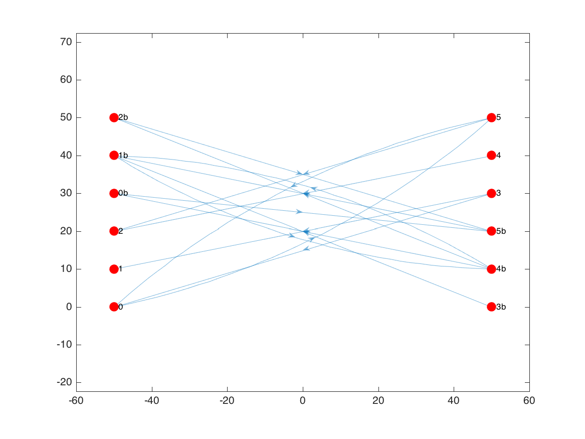
To produce that graph, I started with a table a node coordinates:
N =

     x     y      id
    ___    __    ____

    -50     0    '0'
    -50    10    '1'
    -50    20    '2'
     50     0    '3b'
     50    10    '4b'
     50    20    '5b'
    -50    30    '0b'
    -50    40    '1b'
    -50    50    '2b'
     50    30    '3'
     50    40    '4'
     50    50    '5'
and a table of edge source/target pairs:
E =

    src     tar
    ____    ____

    '0'     '5'
    '3'     '0'
    '3'     '1'
    '5'     '2'
    '5'     '0'
    '4'     '2'
    '3b'    '1b'
    '4b'    '1b'
    '5b'    '1b'
    '4b'    '0b'
    '1b'    '4b'
    '0b'    '5b'
    '4b'    '2b'
    '2b'    '5b'
From these tables, I create a graph object.
1
2
3
4
5
6
7
8
9
[~, sidx] = ismember(E.src, N.id);
[~, tidx] = ismember(E.tar, N.id);
nnode = length(N.x);
nedge = length(E.src);
adj = sparse(sidx, tidx, ones(nedge,1), nnode, nnode);
adj = full(adj);
G = digraph(adj, id);
I’ll also add the node coordinate data as extra Node table properties, which we can use for plotting and will later be required for the divided edge bundling function:
1
2
G.Nodes.x = x(:);
G.Nodes.y = y(:);
We can plot the resulting graph using Matlab’s graph plotting tools:
1
2
3
4
figure('color', 'w');
h = plot(G, 'XData', G.Nodes.x, 'YData', G.Nodes.y, ...
'NodeColor', 'r', 'MarkerSize', 8);
axis equal;
Even with this relatively simple graph, things are getting a bit cluttered, particularly with all the arrowheads centered on the edges.
Using plotdeb.m in initial mode, edges are instead rendered as partially-transparent patches that change color as they move from the source node (0 on the colorbar) to the target node (1):
1
2
3
set(h, 'LineStyle', 'none');
he = plotdeb(G, 'initial', true);
hcb = colorbar('south');
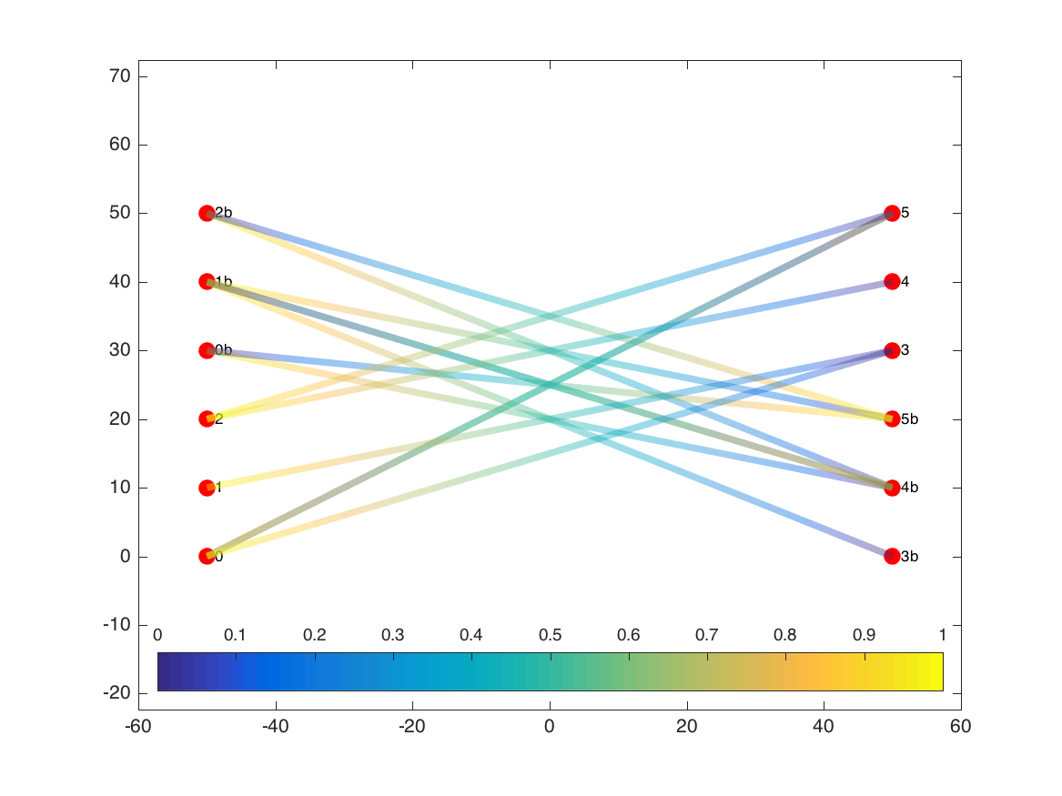
The edge patches also vary in width based on the weight of each edge. In this example, all edges were the same weight, but we can see the effect if we increase the weight of the edge that runs from node 2b to node 5b:
1
2
3
delete(he);
G.Edges.Weight(9) = 2;
he = plotdeb(G, 'initial', true);
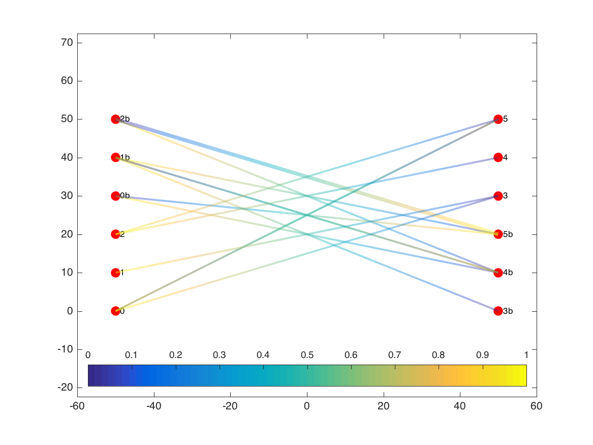
Now we run the edge-bundling algorithm:
1
G = debundle(G);
While the code runs it will print its status to the screen:
Preprocessing...
 100% [=================================================>]   14/  14
 Elapsed time is 0.053588 seconds.
Bundling...
 Pass 1
 100% [=================================================>] Pass 1: 29 of 29
 Elapsed time is 0.103037 seconds.
 Pass 2
 100% [=================================================>] Pass 2: 29 of 29
 Elapsed time is 0.161255 seconds.
 Pass 3
 100% [=================================================>] Pass 3: 29 of 29
 Elapsed time is 0.283332 seconds.
 Pass 4
 100% [=================================================>] Pass 4: 29 of 29
 Elapsed time is 0.572491 seconds.
 Pass 5
 100% [=================================================>] Pass 5: 29 of 29
 Elapsed time is 1.091047 seconds.
Postprocessing...
Done
As I’ll discuss below, my version is quite a bit slower than the original, so depending on the complexity of the graph, you may need to go get some coffee at this point. This example only needs a few seconds, though, and we can now plot the new bundled paths for the edges.
1
2
delete(he);
he2 = plotdeb(G);
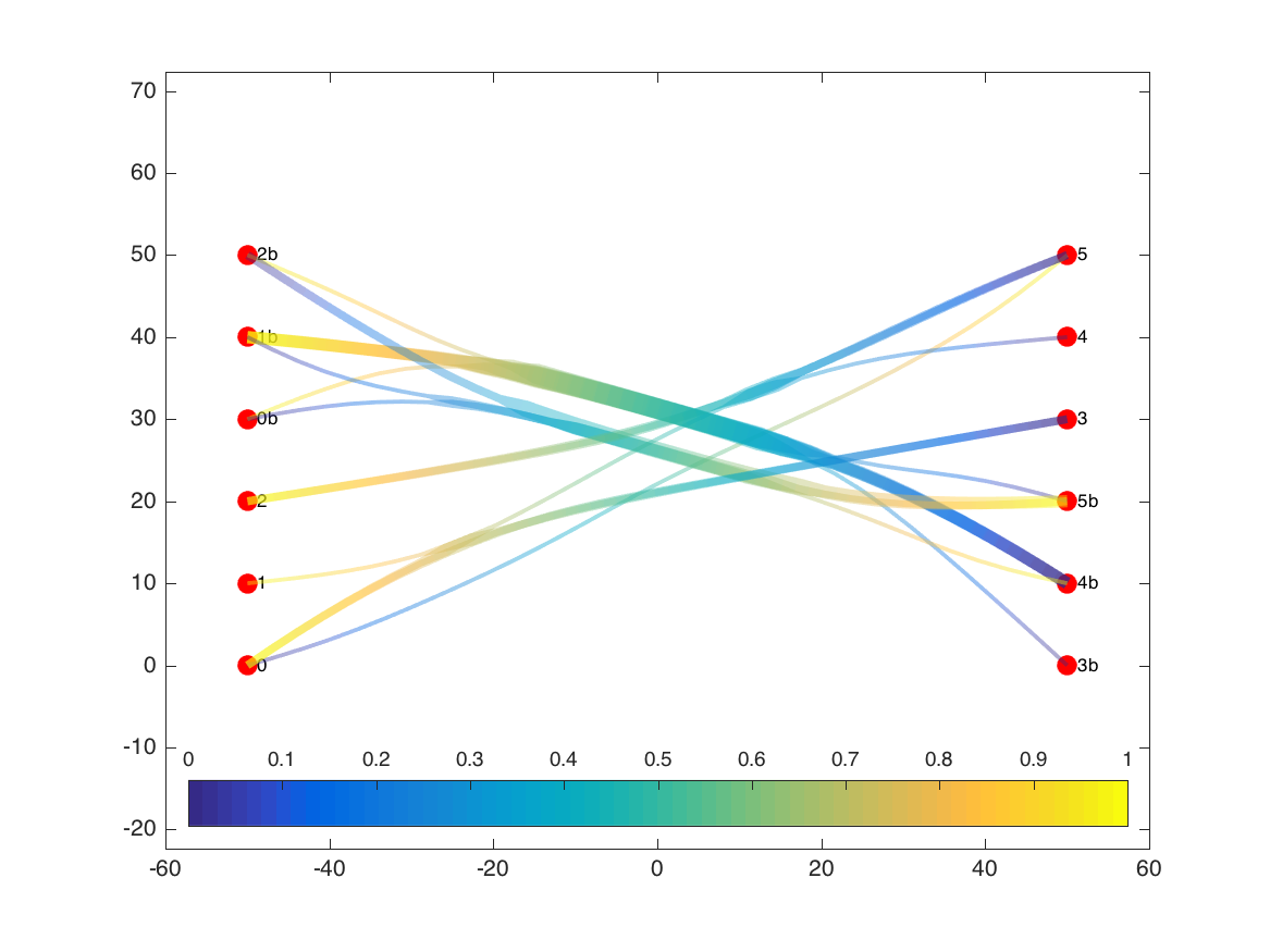
In addition to showing the new bundled-together paths for each of the edges, the plotting routine changes the widths of the edge bundles to reflect the sum total of the weights of the edges at each location. In this version, while we lose some of our ability to trace individual edges from their source to their target, we get a better picture of the main flows in the graph. For example, we can better see the separation of the two subgraphs (b-nodes vs other nodes), and compare the total flow moving from left to right as opposed to right to left in the b-subgraph.
Adapting the algorithm to food webs
Bundling vs. plotting
The original EdgeBundling application reads in a graph topology (including node positions and edge source-target pairs) from a file, accepts a few user-configurable parameters, and on command, runs the bundling calculations and plots the results to the screen. I decided to separate the bundling (debundle.m) and plotting (plotdeb.m) steps, for several reasons.
The first benefit is flexibility. Matlab has a full-featured graphics library, so there’s no need to limit the choices of edge color, transparency, etc. to those hard-coded in the original. This also allows me to plot the nodes separately from the edges, and to add additional details, like the trophic level axis used in my food web diagrams.
The second reason for separating the calculations is speed. I’ve profiled my code pretty thoroughly for any unnecessary bottlenecks, but Matlab is no match for the GPU-accelerated Objective-C Selassie used. And the physical simulation complexity is \(O(E^2C)\) (where \(E\) is the number of edges and \(C\) is the number of control points per edge) for each iteration, which is asking a lot of an interpreted language. A simulation that takes 20-30 s in the C-based software requires a couple hours in the Matlab code. Acceptable to me, since I only need to create these figures once or twice per research project, but I didn’t want to have to rerun everything just to tweak the edge width scaling in a single figure.
The final reason for separating things is due to the addition of scaled weights for bundling, as described in the next section.
Scaled weight function for bundling
Edge weight values are used in both the bundling and plotting steps of the divided edge bundling algorithm.
During the bundling portion, the forces between control points are scaled based on the weight of the edges they are on. Because of this, bundles of low-weight edges whose weights sum to a certain value behave in the same way as a single high-weight edge of that value in terms of attracting other edges.
During the plotting portion, edge width at a given control point is calculated based on the sum of the weights of all control points within a threshhold radius of that point. The result is that overlapping edges are depicted as a single edge with the cumulative weight of the bundle members.
In food web networks, the biomass fluxes represented by edge weights usually span at least 5-7 orders of magnitude due to trophic transfer losses at each predation link. In the food web I happened to be working with at the time I developed this function, the weight difference between the smallest flux (longline bycatch of mammals) and the largest (primary production by small phytoplankton) spanned 14 orders of magnitude. With this weight difference, the forces exerted at the bottom of the food web far surpassed those at the top of the food web, resulting in almost no bundling occurring beyond the first couple of trophic levels. No good.
The usual remedy to this large range in fluxes is to scale them, typically with a strong transformation like a logarithm, cubic root, or square root. Unfortunately, using such a scale loses the additive property that is relied upon for the edge bundling algorithm and visualization.
In the end, I decided that I was willing to sacrifice the additive property of edges during the bundling process itself, but not during the final visualization. An optional input parameter can be passed to the debundle.m function, telling it to scale edge weights prior to beginning its calculations. For my work, I’ve been using the function
1
wtfun = @(x) log10(x) - wmin;
where wmin is the logarithm of the smallest weight, rounded down a bit (to keep all weight values positive as required by the algorithm).
For the visualization, Selassie’s code already included an optional parameter to de-linearize the edge width scaling. The edge width equation is \(D=wg^p\), where \(D\) is the visible edge width, \(w\) is the user-assigned maximum edge width, \(g\) is the bundle weight at a control point, and \(p\) is the scaling parameter. Selassie et al. states that the \(p\) parameter "allows more subtle asymmetries in edge and bundle weight to be seen". In the case of food web networks, we actually want these asymetries deemphasized, which can be accomplished when \(p<1\). I’ve found \(p = \frac{1}{3}\) (cubic root scaling) works pretty well for food webs. The scaling is applied after the bundle weight calculation, so edge bundles still maintain the additive property we want.
Self-edges
The divided edge bundling algorithm removes any self edges prior to calculation, since these edges do not have a constant orientation as needed for the calculations.
Although they do not factor into the bundle calculations, self-edges (i.e. cannibalism) are quite prevelant in ocean ecosystem models, so I wanted to include them in the final visualizations. For this, I included a switch that, when true, plots self-edges as circlular paths.
The next step: Node placement
While this algorithm greatly helped in cleaning up spaghetti-mess edges, it can only be applied to graphs where the coordinates of the nodes are already known (such as the geographic examples in the Selassie et al. paper). While y-coordinates in food webs often correspond to trophic level, the x-coordinates are not constrained.
In their discussion, Selessie et al. noted
A major question unaddressed in both the prior and current work is the interplay between node layout and edge bundling; Holten & van Wijk’s compatibility coefficients are exclusively a function of node position, so layout greatly affects bundling. Automated graph layout algorithms that tend to orthogonalize edges cause force-directed edge bundling techniques to coalesce edges ineffectively. Layout approaches that jointly optimize node placement and edge bundling might enable improved pattern perception.
So to get the best results when applying edge bundling to food webs, we need to start with a node-placement algorithm that optimizes node position for bundling rather than orthagonality. And ideally, one that also allows contraining y-position to match trophic level while allowing free movement in the x-direction. With no such algorithm seemingly readily available, I decided to create my own. Read on to the next blog post to find out the details.