Food webs as network graphs-- Part 2: Node Positioning
This is Part 2 in my three-part series on visualizing food webs as network graphs.
Part 1 – Part 2 – Part 3
Node layout for a food web graph
In the previous post, I discussed a method for bundling graph edges together to reduce clutter and reveal high-level patterns in energy flow. However, the edge-bundling algorithm requires node positions to be set first.
For the purposes of a food web graph, I wanted a node-positioning algorithm with a few different features:
- Node size is scaled based on functional group biomass.
- Nodes don’t overlap each other, regardless of the sizes of each node.
- Node y-position is based on trophic level, with producers at the bottom and apex predators at the top.
- Nodes that share similar predators and prey are positioned close to each other, optimizing the effect of the edge bundling algorithm.
I’ve looked at a lot of exisiting graphing tools, and I’ve never found an out-of-the-box option that meets all of these requirements. In particular, the last two prove elusive. Most tools allow you to specify node coordinates, but not to specify along only one axis while leaving the others free. And most common node-positioning algorithms optimize for orthogonality of edges, which is not necessarily ideal for edge bundling. In the end, I resorted to a custom layout function, and was able to create an algorithm that seems to work well for even very large food webs.
The building blocks
Trophic groups
To meet requirement 4 in our desired node-positioning characterisitcs, we first need a way of quantifying the similarity between groups. For this, I followed the trophic group algorithm developed by Gauzens et al. (2014):
Gauzens B, Thébault E, Lacroix G, Legendre S (2014) Trophic groups and modules: two levels of group detection in food webs. J R Soc Interface 12:1–29
DOI:10.1098/rsif.2014.1176
They define trophic similarity \(T(i,j)\) as
where \(P_i\) and \(p_i\) are the predators and prey of group \(i\), repsectively. This leads to a value ranging from 0 (groups \(i\) and \(j\) have no common predators or prey groups) to 1 (groups \(i\) and \(j\) have identical predators and prey). They then apply a simulated annealing alorithm to isolate groups of nodes such that the within-group trophic similarity values are maximized.
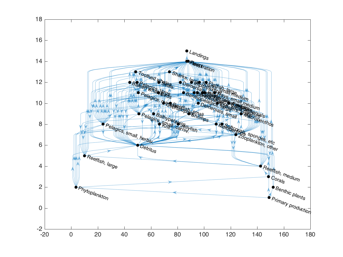
To demonstrate this algorithm, we’ll use one of the food webs that ships with the Ecopath with Ecosim software. This food web represents a generic fisheries ecosystem; its functional groups are already pretty consolidated, but it’s small enough that it makes for a simple example.
We start by reading data from the EwE database file and converting it to a Matlab graph object:
1
2
3
4
Ewein = mdb2ewein('Generic_37.EwEmdb');
G = ecopath2graph(Ewein);
plot(G, 'layout', 'layered', 'direction', 'up', 'nodecolor', 'k');
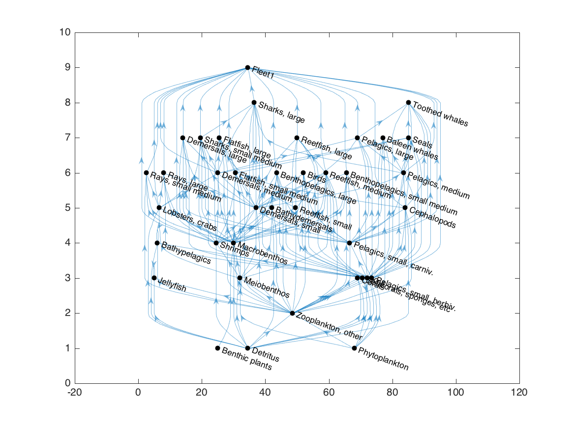
As I’ve written it, the ecopath2graph.m function includes all Ecopath-derived fluxes, both in-system and out-of-system, in the resulting graph object. For the trophic grouping algorithm, we’re only interested in predator-prey interactions, so we’ll delete all out-of-system fluxes (primary production, respiration losses, fisheries landings, and export) and flows to detritus:
1
2
3
4
5
6
7
8
9
10
G2 = G;
detid = G.Nodes.Name(G.Nodes.type == 2);
oosid = G.Nodes.Name(G.Nodes.type == 4);
G = rmnode(G, oosid);
isdet = ismember(G.Edges.EndNodes(:,2), detid);
G = rmedge(G, find(isdet));
h = plot(G, 'layout', 'layered', 'direction', 'up', 'nodecolor', 'k');
We can now run the grouping algorithm, and update the colors of the nodes based on the trophic group indices:
1
2
3
4
5
6
7
8
9
10
adj = adjacency(G2);
grp = gauzensgroup(adj, 'type', 'trophicgroup');
set(h, 'NodeCData', grp, 'NodeColor', 'flat');
ngrp = max(grp);
col = distinguishable_colors(ngrp);
colormap(col);
set(gca, 'clim', [0 ngrp]+0.5);
colorbar;
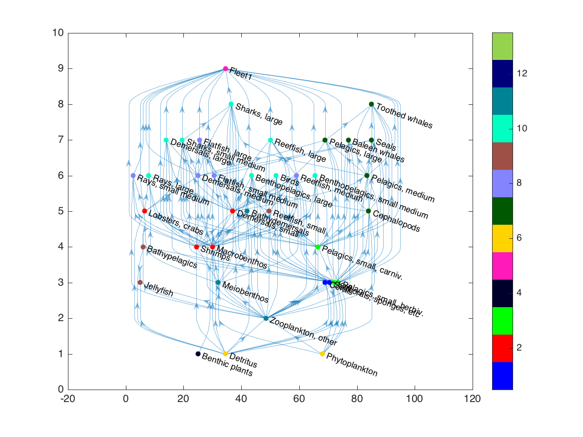
This layered layout is good for visualizing the approximate trophic level of each group, since it positions nodes based on the number of edges leading to and from each, but it doesn’t always keep trophic groups near each other. For a better option, we turn to a force layout.
The force layout
Force-directed layouts are common to many network graphing tools, and work by treating nodes of a graph like charged particles that repel each other but are connected by spring-like edges.
Simply switching to Matlab’s force-directed layout doesn’t exactly achieve what we want:
1
layout(h, 'force');
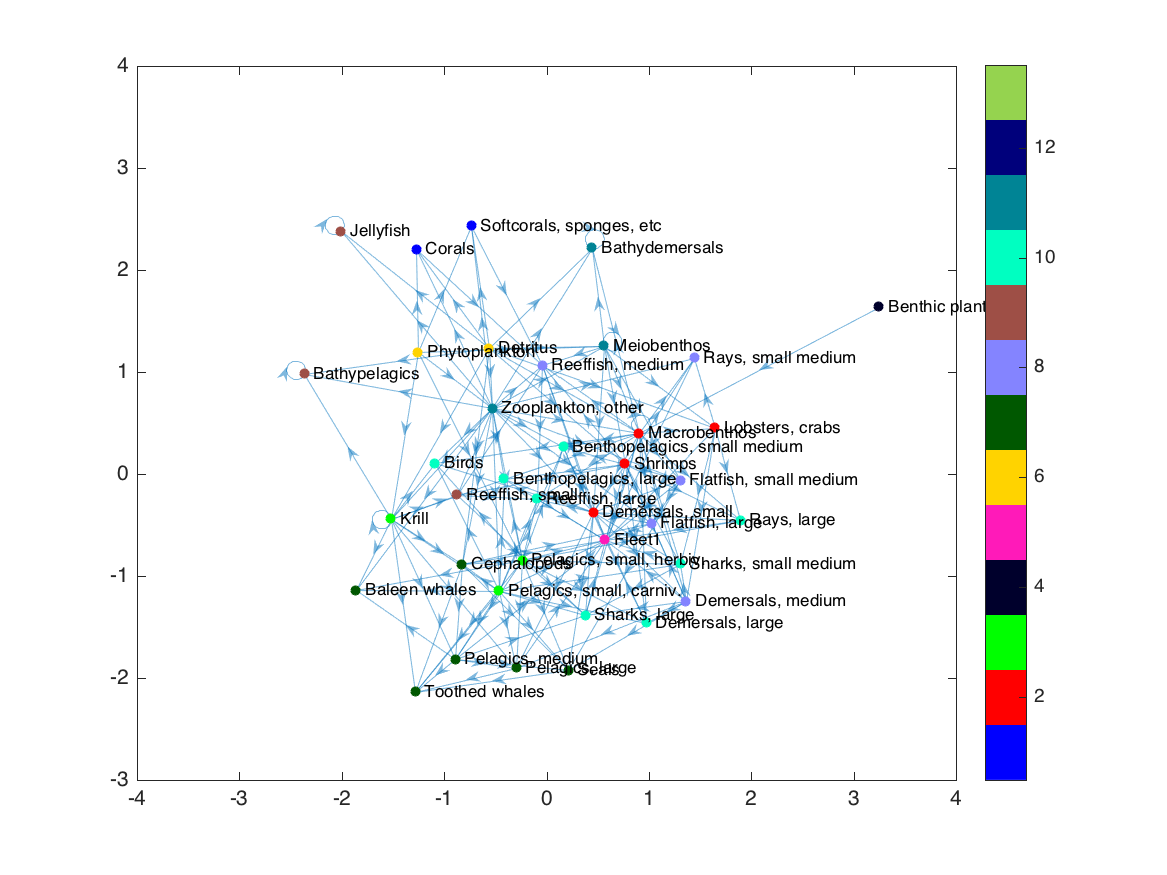
Some trophic groups are still separated from each other, and we’ve lost all sense of trophic level structure. The force layout uses the edges (in this case, the predator-prey connections) to determine where to place nodes. But in our case, we already have a separate metric defining which nodes we want near each other: the trophic group calculation. So the first step in our new layout is to replace the exisiting edges with a new set that connects each node to its “trophic group” node, creating a dendrogram-like graph:
1
2
3
4
5
G3 = trophicgroupgraph(G2, grp);
cdata = [grp; ones(ngrp,1)*(ngrp+1); ngrp+2];
h = plot(G3, 'layout', 'layered', 'direction', 'left', ...
'NodeCData', cdata, 'NodeColor', 'flat');
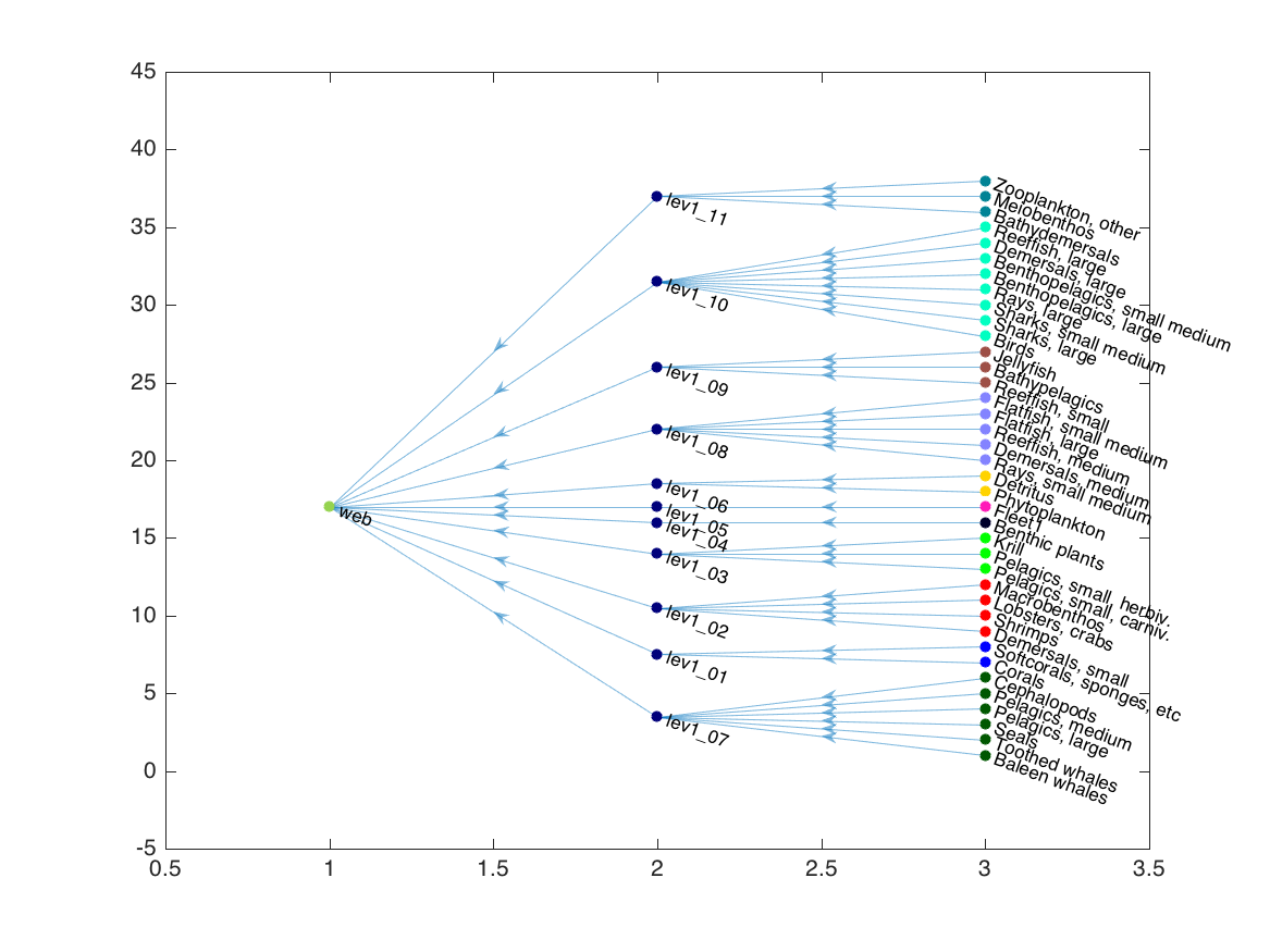
We can remove the “web” node (which is just there to connect the hierarchy), and plot with Matlab’s force layout:
1
2
G3 = rmnode(G3, 'web');
h = plot(G3, 'layout', 'force', 'NodeCData', cdata(1:end-1,:), 'NodeColor', 'flat');
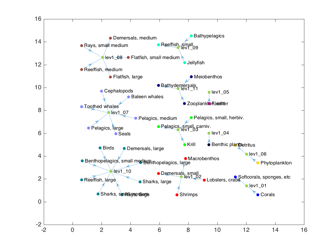
This force layout now succeeds in keeping functionally-similar nodes close to each other (requirement 4), but is missing all the other desired requirements. Enter D3.
The D3 force layout
A few months ago, a colleague introduced me to the D3.js library. D3.js (short for Data Driven Documents) is a javascript library designed to "bind arbitrary data to a Document Object Model (DOM)"… more simply, to dynamically construct interactive web graphics based on underlying datasets. The relatively small set of tools can be used to create an endless array of fascinating infographics.
My experimentation with D3 led me to its force layout tool. Unlike the Matlab implementation I demonstrated in the previous section, the D3 version allows (and in fact encourages) all sorts of interventions as the physical simulation is running. To position nodes, I make the following adjustments:
- Prior to positioning nodes, I attach circles, with area scaled to biomass of the group, to each node position. I use D3’s circle pack layout to calculate the appropriate scaling of circles and also to initiate the node positions (this reduces some unecessary movement one would otherwise get when starting with default random positions).
- As the physical simulation of the force layout runs, I check for collisions between node circles, and when they occur, separate the two nodes in question.
- As the force layout runs, I nudge each node’s y-coordinate towards a specified location based on its trophic level.
- After the nodes have settled into position, I use Evan Wang’s labeler.js plugin to position node labels so they are either inside a node (if the node is large enough to fit the text) or outside but not overlapping any other nodes or text.
The result is below. Reload the page to see it in action.
For more information on using this code, please read on to the next post.